Choosing the Perfect Colors…
Thursday, July 9th, 2009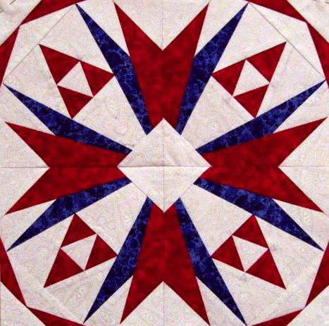
Mary's 5000 Member Block
When I teach classes, I often cover the topic of choosing fabrics for a project. Most quilters are timid and unsure in this area of patchwork. Recently I uploaded a new block design for the Carol Doak Yahoo Group. It was in honor of our group reaching 5,000 members. Lots of members have been making the block and uploading pictures. Mary used a white background with red and blue to produce a very patriotic block.
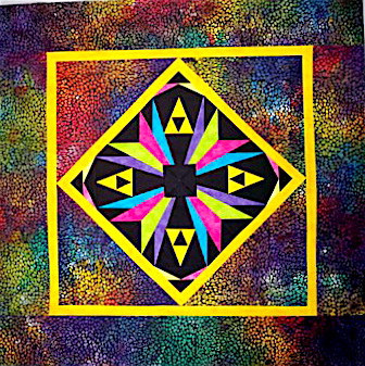
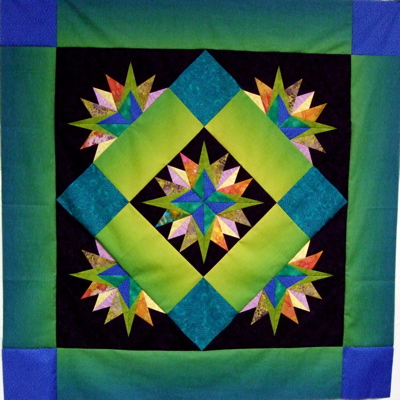
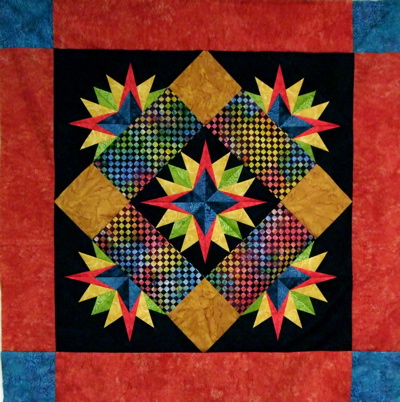
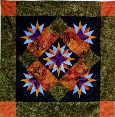
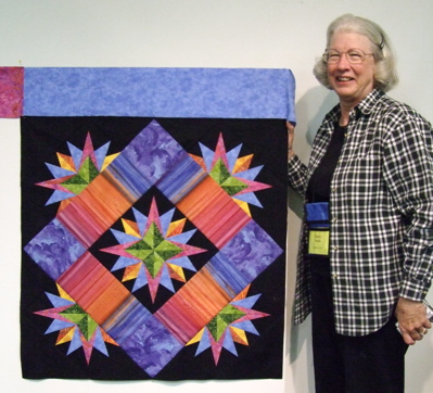
Linda's colorful block made into a small wall quilt.
Linda chose a black background and a variety of bright colors. She also found the perfect multi-color setting fabric. This wall quilt has a contemporary feel.
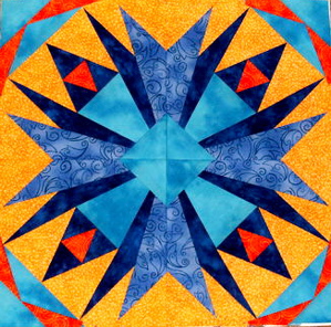
Kathi in Georgia gets our attention
Blue and orange create a very strong contrast and this one has great attention getting appeal.
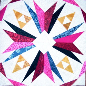
Bonitahounds
This block has a graphic appeal and a variety of fabrics and colors to keep our interest.
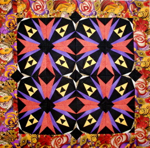
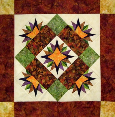
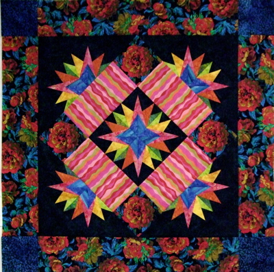
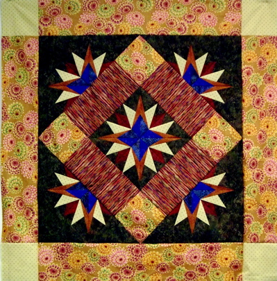
Cathy in Maryland
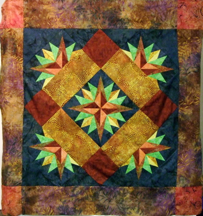
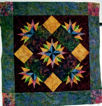
Cathy in Maryland chose her colors from the border fabric she used to frame her four blocks. Wonder if Cathy would have chosen the colors without the border fabric? Perhaps yes but perhaps it was the comfort of seeing them work together in the border that inspired her.
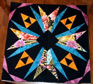
Patti's block
When I first saw this block, I noticed that great print fabric used in the rays. It almost gives a lacy appearance to the block.
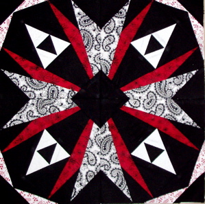
Carol, Cathy's Mom
Now Carol may be related to Cathy, but she definitely marches to a different drummer. The simplicity of the shades of black and red are wonderfully graphic.
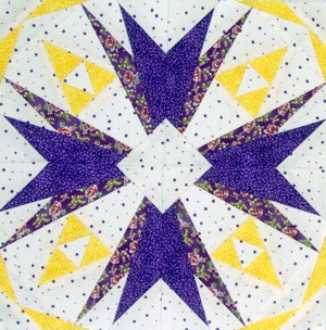
Barb's block
Doesn’t Barb’s block just make you think of early spring with the purple and yellow flowers decorating the earth?
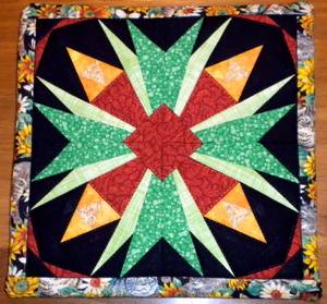
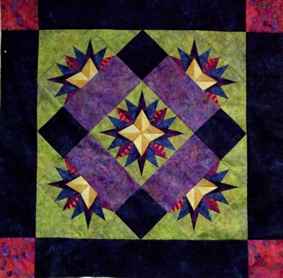
Anita D.'s block was turned into a Trivet
Anita’s colors against the solid black are very graphic. My question is the chicken and the egg…did Anita have the border fabric and choose her colors from it, or did she choose her colors and found the perfect border fabric?
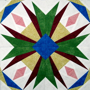
Merilyn from Australia
Most of the fabrics in this block read solid against the white background. Using that very dark maroon for those spikes really make them stand out and give this block a delicate look.
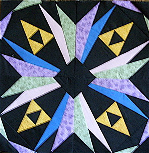
Chris in Oregon
Chris has a graphic block too, but she chose more pastel colors to give it a soft look as well.
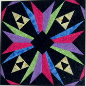
Lida in MA
Lida’s block just celebrates color!
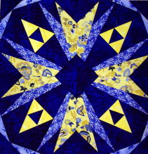
Barbara in TX
Many quilters do love the combination of blue and yellow. Barbara did it well with plenty of contrast and interest in the textures of her fabrics.
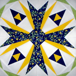
Pat F
Pat used blue and yellow also, but went for a neutral white background and added an accent of green in the four corners.
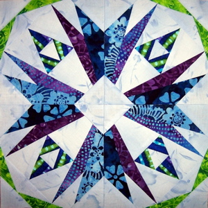
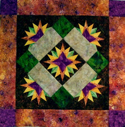
Carole D
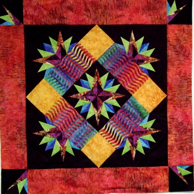
The batik style fabric that Carole used in her block gives it a tropical personality.
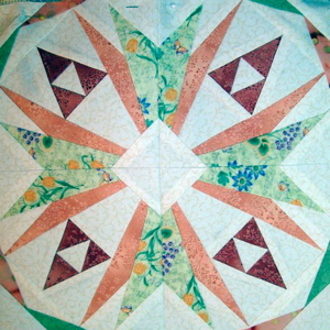
Janice in TN
The floral print Janice used was a great jumping off place to combine the colors she used. I really like the darker red triangles in between because they add a bit of spice to this block.
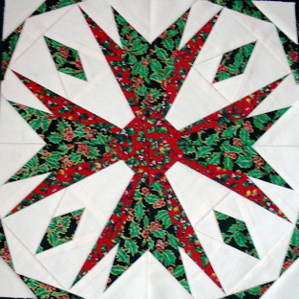
Suzanne's block
It is beginning to look a lot like Christmas. Suzanne’s Christmas fabrics definitely define the purpose for this graphic block.
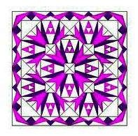
Patty C wanted to play
Patty C wanted to play with the possibility of using this block to create a medallion style quilt. She limited her color selection, but that doesn’t mean it can’t be expanded to include more colors later.
As I looked through the blocks that were posted and noted the different approaches members took to make their blocks, it brought home that choosing the perfect colors is simply a matter of choosing the colors that achieve your goal.
All the best,
Carol


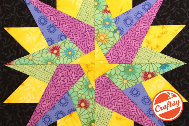
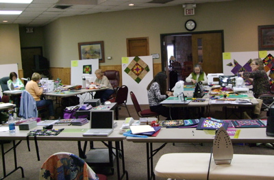
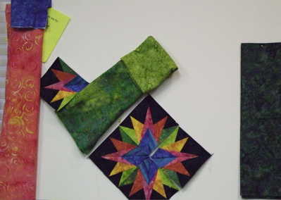 As the blocks were made they were put up on the design wall to audition different fabric choices.
 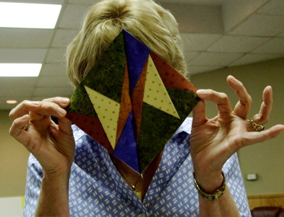 The students learned to baste their sections to check for a good match. Nancy Ament was thrilled that she was in the basting stage when she opened her block to see she had added two of the same sections…we did have a chuckle over that one. The setting was wonderful and we all bonded as a group throughout the week. Lots of fun, laughs and learning took place.