What A Difference Color Makes!
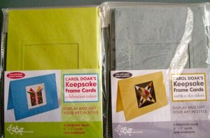 A few months back I was delighted to receive the new colorways for the Carol Doak Keepsake Frame Cards.
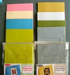
One new colorway was called “Celebration Colors” containing a yellow green, a sea-foam blue, a cream and a happy pink. The “Earth and Sky Colors” started off with a flannel gray, a rich deep green, a white with a hint of gray and a wonderful maize color. Although I enjoyed using all the new colors, rather than the traditional white previously available, I never realized what a difference they make in the overall look and tone of the card until I was auditioning a new sail boat block today inside a variety of colors today. I thought I would share with you what I saw.
 For comparison purposes, here is the standard white card. The colors of the block stand out from the card, but the card does not add anything to the block.
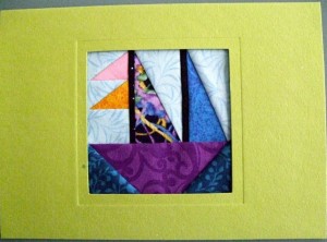 Here is the yellow green card in the Celebration Colorway. The green is a happy green and the blues contrast nicely against it.
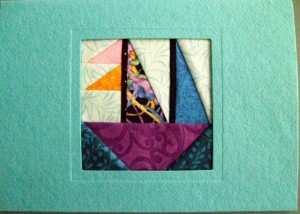 The blue card from the Celebration Colors makes a connection to the blues in the block. The lighter blue sky and darker blue water still stand apart from the card.
 The cream card from the Celebration Colors is softer than the white card, but still permits all the colors in the block to pop.
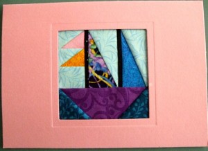 I think the pink card from the Celebration Colors gives this card a playful tone. The blues really pop but it also makes a connection with the bits of pink in the card.
 The flannel gray card from the Earth and Sky Colorway gives this card a more conservative tone now. The colors still pop but the seem more toned down.
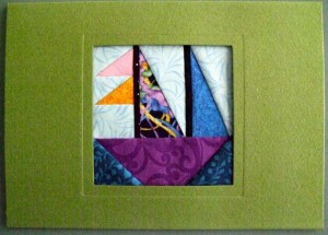 The rich green from the Earth and Sky Colorway gives the card a rather regal look. I now see bits of green in the print.
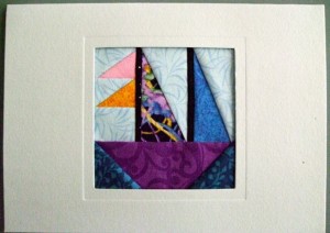 The off-white with a bit of gray from the Earth & Sky colorway provides a neutral ground for all the colors to pop without interacting with them.
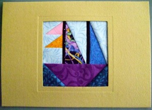 The wonderful maize color from the Earth & Sky colorway adds warmth to the card and really lets the colors pop.
So, my conclusion regarding which color to use with my boat really depends upon the age and gender of the recipient of the card. If I was sending this card to a young person (or maybe someone young at heart), I probably would select one of the Celebration Cards. If I was sending it to a more mature person or a conservative person, I probably would go with one of the Earth & Sky colors. It is so nice to have choices!
Which is your favorite card color?
All the best,
Carol


